| A Pictorial List:
Best Album Covers |
| |
|
When fans run out of music lists to discuss, they usually
resort to talking about album covers. Having designed a few of those
in my time, and having taken introductory college courses in art
history, I feel totally authorized to jump into the fray. I picked
out all the covers here that I thought were worth talking about;
most of them are from the early days, because my taste in the covers
seems to pretty closely parallel my taste in the music. Here goes:
From Genesis to Revelation
There were so many different versions and releases of this album
that it's hard to see them all, but I think that most of them were
fairly second rate, as the rights to this album are owned by second
rate record companies. There was one newer release of the CD that
I thought was cool, but couldn't find an image of on the web. The
cover had a sort of letterbox shot, with black bars on the top and
bottom. The middle was an illustration of a path leading over a
grassy hill, with an open wood fence on one side. It looked sort
of Japanese in style, and washed out in color. It reminded me of
fantasy illustrations and I thought it was very pretty and romantic,
and very reminiscent of the feel of the album itself.
|
| |
|
|
| |
 |
|
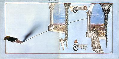
Trespass and the Paul Whitehead Years
It's funny how my favorite period of the band musically
also features my favorite album covers. It's either a credit
to the artist for accurately reproducing their music visually,
or a good indication of how much my artistic taste is affected
by association. I showed the whole cover of this album above
because I love the image of the knife cutting all the way
across the cover. I think Paul was really excellent at capturing
the romanticism and other-worldly quality of Genesis music
of the early 70s. In a more specific sense, he could incorporate
lyrical elements from the songs on the album, such as the
angel and the knife and (possibly) the mountains on this cover.
I remember hearing that the original concept was to have the
inside of the room be black and white, and only the exterior
in color, so that the contrast would bring out the color even
more and provide a neat, surreal effect. They were unable
to get the effect to work, however, as the interior kept coming
out very bluish. But, no big loss; the blue puts a sort of
melancholy into the whole thing that is very appropriate.
|
|
| |
 |
|
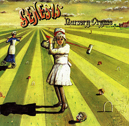
Nursery Cryme
Here we have a classic album cover from the 70s, a very
memorable image that you'd expect to belong on the front of
a heavy metal record. It's still the perfect image to convey
the dark, twisted, English humour behind all the lyrics on
this album, and I think it's quite fair that "The Musical
Box" is the only song visually represented on the front.
It's the most visual song and (I think) the most important
track on the album.
Incidentally, it's a shame that CDs have made LP-size artwork
and big liner-note interior images a thing of the past. One
of the things the Genesis albums of the '70s had going for
them was all the extra incidental characters and imagery on
the inside of the packaging, which many of the more
recent releases have ignored.
|
|
| |
 |
| |
|
|
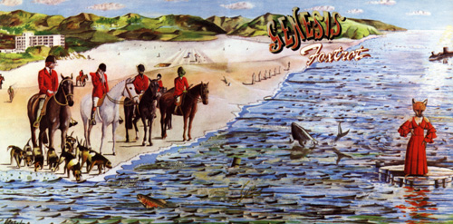
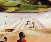
Foxtrot
These Whitehead covers are really among my favorite album
covers, because there's so much in them, and it all has so much
to do with the music. This one has a bunch of imagery from various
songs on the album if you look closely enough, plus even a nod
to the previous album (see left detail)! The female fox/human
creature on the front is not actually a reference to Pete's
first venture into costumes on stage, but became an inspiration
for him (his first appearance in the costume, 28 Sept. 1972,
was after this album was released)--so in this case the band
was influenced by the artwork, not the other way around. This
cover, Nursery Cryme and The Lamb Lies Down on Broadway
are actually from scans I made of my own CD inserts. |
|
| |
 |
|
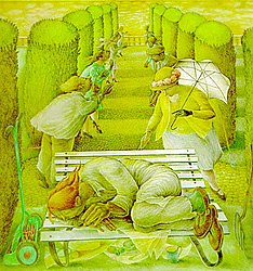
Selling England by
the Pound
Betty Swanwick painted this image. I think the coloring
of this image might be a little off; I got it from someone's
web site and recropped and resized it. It's not too far a move
from Whitehead in concept, although the style and execution
actually seem a bit more competent and developed than Whitehead.
Again we see a romantic, dreamy vocabulary of imagery, complimenting
the album nicely. Various English characters appear in file
behind the dozing lawnmower from "I Know What I Like."
Just a very pretty, eloquent piece. I have since learned (from
Scott McMahan's discography) that this painting was done before
the album, and that Peter Gabriel's seeing it actually inspired
the lyrics to "I Know What I Like." The painter then
added the lawnmower into the painting and it was used for the
cover. Another example of the artwork feeding off of the music
and vice versa--these kinds of connections make for very good
album covers. |
|
| |
 |
|
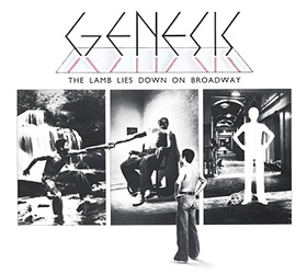
The Lamb Lies Down
on Broadway
For this cover Genesis used an actual design house, Hipgnosis,
and went with photography instead of painting. This is actually
a move that accurately mirrors their changing musical style.
This album is composed of shorter, rockier tunes, with less
romanticism and more realism (and surrealism). And obviously,
since the whole story refers to N.Y.C., British imagery is out!
The three-pane format here is a presage of their live show set-up,
and the multiple Raels depict the concept of split personality
that is at the core of the Lamb's symbolism. This is also clear
in the mirrored logo, which is one of my favorite Genesis logos
(although Paul Whitehead's for NC and Foxtrot is probably
my all-time favorite). Rael also seems to be put into three
different songs from the album here: my guesses are "In
the Rapids," "The Waiting Room" and "The
Carpet Crawlers." |
|
| |
 |
| |
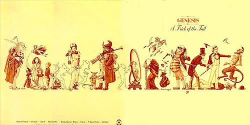
A Trick of the Tail
Again Hipgnosis does the honors here, and comes up with a Victorian-era
British-style series of characters from various walks of life. They
all seem like illustrations from 19th century advertisements. There
are magical creatures and flying spirits. Almost every character here
can be matched with a song from the album. It's fun to guess! This
is great stuff, and wonderfully representative of the feel of this
music--after the shift in sound signalled by The Lamb, this
album was almost a return to the sound of the early 70s, albiet slightly
softer in tone overall. |
| |
|
|
| |
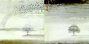
Wind and Wuthering
The sleeve design for this one is credited once again to "Hipgnosis/Colin
Elgie," as the last album was. If Colin is behind the artwork,
he took a bit of a different tack this time. Still romantic, nostalgiac
and dreamy, but here instead of a cast of characters there is one
main image. The album title itself is a reference to the novel Wuthering
Heights, as is the instrumental medley at the end, which quotes
the last line of the book in its title. I think this cover is mainly
dealing with that instrumental track and the feelings it induces in
relation to the book (just going on instinct here, and the fact that
it's clearly NOT specifically referencing the stories in any of the
other tracks). I loved the visual trick of what seems to be a tree
in full leaf transforming into a bare tree that was simply covered
in birds. The idea of something not being what it appears--or changing
upon closer observation--that is conveyed by this image, is perhaps
applicable to Genesis and their music. I love the atmospheric quality
of this cover, and the moist, rainy look of it. A lot of the songs
on this album make me think of rainy, overcast days like this, especially
"Unquiet slumbers" and "Blood on the Rooftops."
|
| |
 |
|
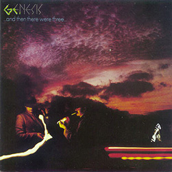
...And Then There
Were Three...
Like some Genesis lyrics, this cover appeals to me because
of its cryptic quality. In conjunction with the title, which
seems to speak of a narrative and to have some story behind
it, we see that something is going on here, but we're not given
enough information to solve the puzzle. There are some strange
streaks of light and a troubled sky and some shady characters,
and what does it all mean?? Whatever it means, it seems certain
that there is a long and detailed story that would explain it.
I like this mystery and this narrative picture. This album is
full of stories and colorful characters, enough for several
album covers, but the strength and eloquence of this cover is
how it includes any number of possible stories into this one
simplified image. The spirit or feeling of the music on these
albums is always connected (for me) with the album cover, and
when I here the opening strains of "Down and Out"
I always have this image of a darkening sky over a vast plain
in my head. This cover is composed of photography, not illustrations
like the last two, which I also think is representative of a
corresponding shift in musical style, similar to the shift from
SEbtP to The Lamb. |
|
| |
 |
|
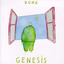
Duke
For this album Genesis moved into more songwriting that
came out of jams between the various band members, and their
music became more simplistic and fluid. Accordingly, for the
album cover the design went away from Hipgnosis and back to
a single illustrator--in this case, Lionel Koechlin. His style
is abstracted and simplistic. The character of "Albert"
is on the cover, the same guy Phil used to introduce the music
from the album in concert; I like the illustrated Albert, and
the various images in the liner notes in this same style, but
I'm not so sure that they fit entirely with the spirit of the
music. Yes, there is simpler music on this record, and it is
dreamy in parts like the floating Albert and his window, but
there is also very powerful, dramatic and aggressive music that
is at odds with Koechlin's style. This conflict is probably
related to the fact that Koechlin's illustrations were not made
specifically for this album, but were already extant before
they were used here. Still, some strong, iconic imagery
for a strong, iconic album. |
|
| |
 |
| |
 |
|
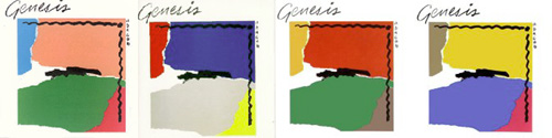
The Abacabs or What's so Funny About Peace Love and Modern
Art? and the 3x3 EP
I'm putting the Abacab covers here because I like
the idea of the series, but also because many seem to despise
this cover for what I think is a bad reason. "Anybody
can do that!" This is the universal criticism for a large
range of modern art and 20th century art, but I hate to hear
people say it, because I don't agree. There is something to
say for purity of form and beauty of composition, and going
beyond mere representation of real forms. So no, not anybody
can do that. Even if they could, they didn't! This guy did!
His name is Bill Smith, and he also helped design the previous
album. That having been said, I don't think this is really
a very good example of this type of artwork! I just don't
think people should criticize it just because it's not a mountian
landscape painting that you could hang above your couch. The
original vinyl album was released in four different color
schemes, which I think are depicted accurately above. The
one on the left was used for the original release of the CD
(I don't think the CDs were released in all four color schemes
at once, but only one per release). The remastered edition
of the CD uses the second scheme. A gold edition of the album
was released that used the third image, perhaps exclusively.
I've never seen the third and fourth covers in person. People
say that there were many variations on these four schemes,
most likely caused by minor differences in printing processes
in different rounds of releases. People also like to say that
this idea was a cheap marketing ploy to make people buy more
copies of the album; that may be true for all I know, but
I still think it's a cool concept. The simplistic, abstract
quality of this art does have a connection to the direction
of Genesis' music, but it has clearly lost the specific lyrical
references of older releases like A Trick of the Tail.
The world of art and album covers was changing even as pop
music was changing. Everything is interconnected.
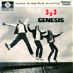
A good indication of the top 40 slant and growing popular
appeal of Genesis' music was reflected by the choice of cover
for their 3x3 EP, which was a spoof of a Beatles cover,
and a rare egoistic band photo. I like it for the humour in
it, and for the reference to another rock band. It's rare
that Genesis give an indication that they're paying attention
to music around them, and while The Beatles weren't exactly
a contemporary of the band (ever--the Beatles would break
up just one year after the release of the first Genesis album),
it still shows a certain amount of pop music culture awareness.
(Unfortunately, I couldn't find an image of the cover that
was any bigger than this one--and I don't have a copy of it
myself to photograph!)
|
|
| |
|
|
| |
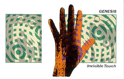
Invisible Touch
Lastly, we have Invisible Touch, an album cover as deeply
immersed in the style of the 80s as its music. I like the translucent,
textured hand. This abstract art is really quite a bit more cryptic
than the old illustrated stuff, though, and it's hard to make out
what the intention is in putting this rounded grid pattern over the
nuclear family. It does make me think of a sort of radiation effect,
but that might just be because I heard a rumour a long time ago that
Invisible Touch was actually a concept album about nuclear
holocaust! This one appears to have come from a design house, Assorted
iMaGes--not Hipgnosis, interestingly enough. This is not my favorite
cover, but it has an iconic quality about it that makes it strong
and universal, in a way; like a street sign, but one that actually
obscures meaning instead of conveying it. |
|
|
|